-
Hajipur, Bihar, 844101
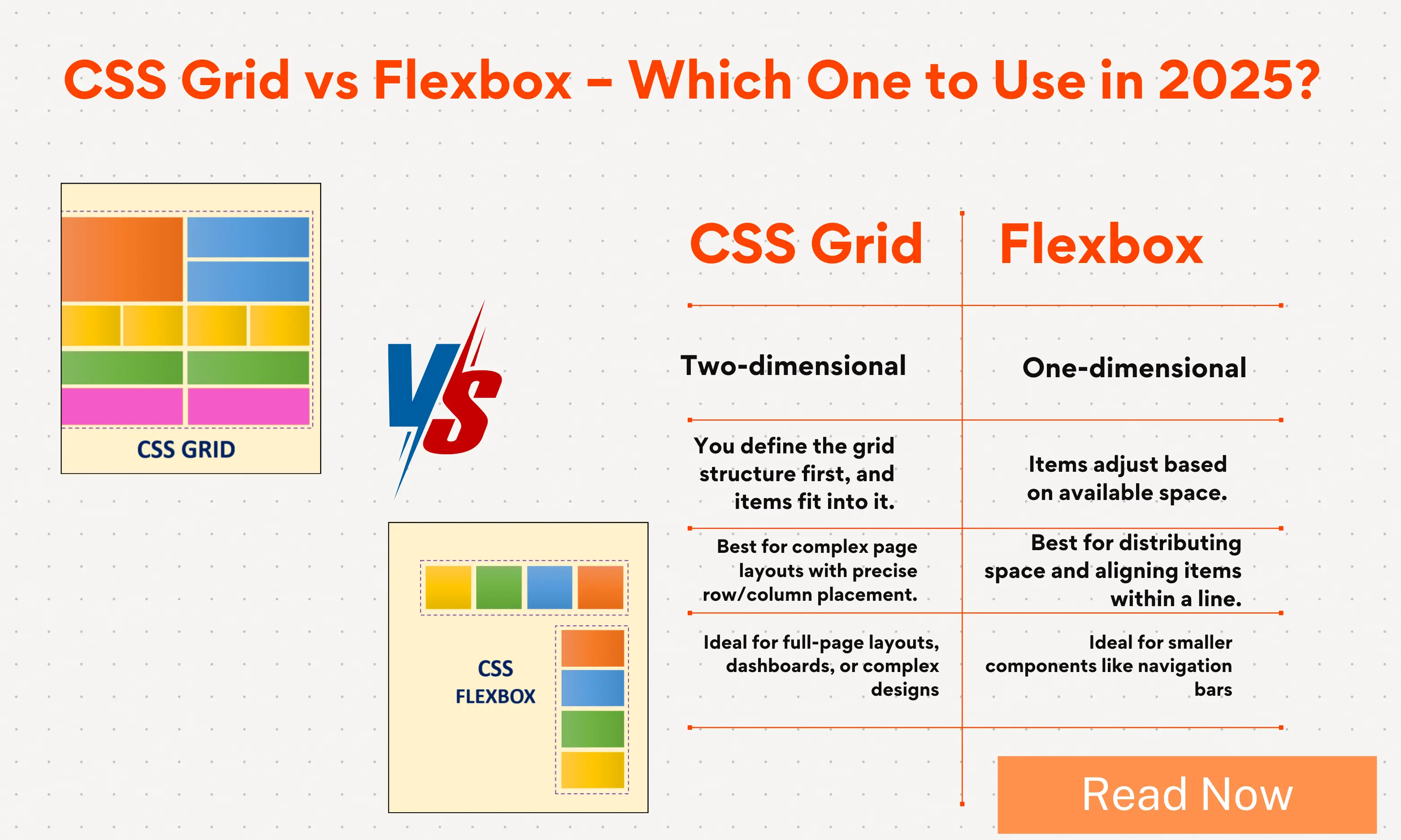
CSS Grid vs Flexbox – Which Layout Should You Use in 2025?
Published By
Bikki SinghWeb design has come a long way in the past decade. If you’ve been building websites for a few years, you probably remember how difficult layouts used to be. Developers had to rely on floats, tables, or endless position: absolute hacks just to make things line up. Those methods worked, but they were frustrating, messy, and hard to maintain.
Then came Flexbox and CSS Grid—two powerful layout systems that changed the way we structure websites forever. Today, almost every developer uses them, whether they realize it or not.
But even in 2025, one big question remains: Should you use Flexbox or CSS Grid for your layouts?
That’s what we’ll figure out in this blog. I’ll explain both in simple, show you their strengths, compare real-world use cases, and guide you on when to pick one or the other. By the end, you’ll know exactly how to make the right choice for your projects.
What is Flexbox in CSS?
Let’s start with Flexbox, which stands for Flexible Box Layout.
Flexbox is a one-dimensional layout system. That means it works in one direction at a time: either horizontally (row) or vertically (column). It’s perfect when you want to arrange items neatly in a line and control how they stretch, shrink, or align.
Think of it like stacking books on a shelf. You can line them up left to right, space them evenly, or push one book to the far right while keeping others to the left. Flexbox gives you fine control over that kind of arrangement.
Everyday Examples of Flexbox
-
Navigation bar – where you want menu items spread evenly across a row.
-
Centering content – for example, putting a login form in the exact middle of the page.
-
Equal height cards – like product cards that adjust automatically to fit different amounts of text.
-
Form inputs and buttons – aligning labels, inputs, and submit buttons neatly.
Here’s a simple Flexbox example for a navbar:
nav {
  display: flex;
  justify-content: space-between;
  align-items: center;
}
This short piece of CSS makes sure the items inside the nav spread out evenly, and everything stays centered vertically. Without Flexbox, this used to take much more code.
👉 👉 Explore Flexbox Tutorial: Flexbox Tutorial
What is CSS Grid Layout?
Now let’s talk about CSS Grid.
CSS Grid is a two-dimensional layout system. That means it works in both rows and columns at the same time. With Grid, you can define an entire page structure in just a few lines of CSS.
Think of it like drawing a table or a spreadsheet. You define rows and columns, and then you place items into those slots. Some items can span across multiple rows or columns, just like merged cells in Excel.
Everyday Examples of CSS Grid
-
Full page layouts – header, sidebar, content area, footer.
-
Photo galleries – aligning images neatly in rows and columns.
-
Dashboards – multiple cards of different sizes fitting together perfectly.
-
Magazine-style layouts – with overlapping sections, different sizes, and more creative freedom.
Here’s a simple CSS Grid example for a 3-column layout with header and footer:
.container {
  display: grid;
  grid-template-columns: 200px 1fr 200px;
  grid-template-rows: 100px 1fr 50px;
}
This creates a layout with three columns and three rows. In just two lines, you can define the whole page skeleton. That’s the power of Grid.
👉 👉 Explore CSS Grid Layout Tutorial: CSS Grid Layout
CSS Grid vs Flexbox: The Key Differences
Now that we know what they are, let’s compare them in plain words.
-
Direction
-
Flexbox works in one direction (row or column).
-
Grid works in two directions (rows and columns).
-
-
Content vs Layout First
-
Flexbox is content-driven. Items adjust based on their size and the available space.
-
Grid is layout-driven. You set up the structure, and items are placed into it.
-
-
Use Cases
-
Flexbox is best for small, linear layouts like navbars, buttons, or card groups.
-
Grid is best for bigger, complex layouts like web pages, dashboards, or galleries.
-
-
Learning Curve
-
Flexbox is easier to learn for beginners.
-
Grid takes a bit more time, but it gives you much more control.
-
When to Use Flexbox in 2025
Even though CSS Grid is very powerful, Flexbox still has a big role in 2025. In fact, it’s often the simplest and most efficient choice for many tasks.
Here’s where Flexbox shines:
1. Navigation Bars
Almost every website has a navbar. Flexbox makes them responsive and clean with very little code.
2. Centering Elements
Vertical centering used to be a nightmare in CSS. Flexbox fixed that forever.
.container {
  display: flex;
  justify-content: center;
  align-items: center;
}
This centers anything inside .container both horizontally and vertically.
3. Equal Height Components
Whether it’s pricing cards, blog teasers, or product boxes, Flexbox makes sure all items line up neatly, even if the content inside them is different.
4. Small Components
For small UI parts like buttons with icons, toolbars, form rows, or dropdowns, Flexbox is faster and cleaner than Grid.
When to Use CSS Grid in 2025
Now let’s see where Grid is the hero.
1. Page Layouts
If you’re building a full page structure with header, sidebar, content, and footer, Grid is the easiest way. You don’t need multiple wrappers or complex nesting.
2. Dashboards
Dashboards often have multiple cards of different sizes. With Grid, you can define areas and let items span rows or columns.
3. Photo Galleries
Images of different sizes can align beautifully with Grid. You can even use grid-auto-flow: dense; to fill in the gaps.
4. Creative Layouts
If you want something like a magazine-style page with overlapping sections, Grid gives you the control Flexbox can’t.
Flexbox vs Grid: Real-Life Comparisons
Let’s compare them with examples you’ll probably face while building websites.
Example 1: A Simple Navbar
-
Flexbox: Perfect. Quick, simple, clean.
-
Grid: Overkill for such a small job.
Example 2: A Three-Column Layout
-
Flexbox: Possible, but requires nested containers.
-
Grid: Done in a few lines of CSS.
Example 3: A Product Listing Page
-
Flexbox: Works fine if products are uniform.
-
Grid: Better when you want everything aligned across rows and columns.
CSS Grid vs Flexbox for Responsive Design
Responsive design is one of the most important parts of modern web development. Both Flexbox and Grid make it easier than ever.
-
Flexbox naturally adapts to content. For example, items can wrap to the next line when space runs out.
-
Grid lets you define layouts that adapt with
auto-fit,minmax(), and fractional units. This means you can create responsive grids without writing too many media queries.
In 2025, most developers use both together to create clean responsive layouts.
Advantages of Flexbox (2025)
-
Easy to learn and use.
-
Great for one-dimensional layouts.
-
Best for small components and UI elements.
-
Requires less code for simple tasks.
-
Still widely supported and reliable.
Advantages of CSS Grid (2025)
-
Handles two-dimensional layouts with ease.
-
Creates complex page structures in fewer lines.
-
Works great for responsive layouts.
-
Features like
grid-template-areasmake code easy to read. -
Eliminates messy nested containers.
Common Mistakes Developers Make
Even in 2025, developers sometimes misuse these tools. Here are some common errors:
-
Using Grid for everything – Some layouts don’t need the complexity of Grid.
-
Overcomplicating with Flexbox – Forcing page layouts with Flexbox often leads to too many nested divs.
-
Not combining them – The real power comes from using them together. Grid for structure, Flexbox for details.
Should You Use CSS Grid or Flexbox in 2025?
Here’s the short answer: Use both.
-
Use Grid for the big picture: page layout, galleries, dashboards.
-
Use Flexbox for smaller pieces inside the layout: navbars, buttons, toolbars.
Think of it like building a house. Grid is the blueprint for the walls and rooms. Flexbox is how you arrange the furniture inside those rooms.
Final Conclusion: CSS Grid vs Flexbox in 2025
If you were hoping for a single winner, here’s the truth: there isn’t one.
Both Flexbox and CSS Grid are powerful tools that serve different purposes. In 2025, the smartest approach is to understand what each does best and use them together.
-
Flexbox is your tool for one-dimensional layouts—rows or columns.
-
Grid is your tool for two-dimensional layouts—rows and columns together.
-
Together, they give you the most modern, responsive, and clean layouts possible.
So the next time you build a project, don’t ask “Which one should I use?”. Instead ask, “What does this layout need?”. The answer will guide you to Flexbox, Grid, or a combination of both.
That’s how web design in 2025 stays simple, powerful, and future-proof.
Frequently Asked Questions (FAQs)
Q1: What is the difference between CSS Grid and Flexbox?
Flexbox is a one-dimensional layout system that works in either a row or a column, while CSS Grid is a two-dimensional layout system that controls both rows and columns together.
Q2: Is CSS Grid better than Flexbox in 2025?
Neither is better overall. CSS Grid is best for page layouts and two-dimensional designs, while Flexbox is better for smaller, one-dimensional layouts like navbars, buttons, and forms.
Q3: Should I use Flexbox or Grid for responsive design?
Use both. Flexbox adapts content naturally, while CSS Grid makes complex responsive layouts easier with features like auto-fit and minmax().
Q4: Can I build an entire website with only Flexbox?
Yes, but it’s not efficient. Flexbox works well for simple layouts, but large page structures are easier and cleaner with CSS Grid.
Q5: When should I use Flexbox instead of Grid?
Use Flexbox for small components, alignment, and one-direction layouts like navbars, toolbars, or buttons. Use Grid when you need to manage both rows and columns, such as dashboards, galleries, or full-page layouts.
Related Tags:
CSS Grid vs Flexbox
CSS Grid vs Flexbox 2025
difference between CSS Grid and Flexbox
Flexbox vs Grid responsive design
when to use CSS Grid
when to use Flexbox
CSS layout techniques 2025
Flexbox examples for web design
CSS Grid examples for websites
CSS Grid vs Flexbox performance
Flexbox vs Grid best practices
CSS Grid vs Flexbox for beginners
CSS Grid vs Flexbox use cases
modern CSS layouts 2025
CSS Grid vs Flexbox for web developers

Hi, I'm Bikki Singh — Full Stack Developer, coding language trainer, and founder of CodePractice.in. With 5+ years of hands-on web development experience, I've trained 500+ students across India in Python, PHP, Java, C, C++, MySQL, and front-end technologies like HTML, CSS, and JavaScript. I started CodePractice.in with one goal: make programming education practical, not theoretical. Every tutorial and blog I write is built around real projects and interview scenarios — so learners don't just understand code, they can actually use it.
Read Coding Blogs on Different Topics
Learn Our Free Tutorials on
Submit Your Reviews